Google Drive

A New Selection Model & Easier Organization  ·  2013—2014

Google Drive - Selection & Organization

Background

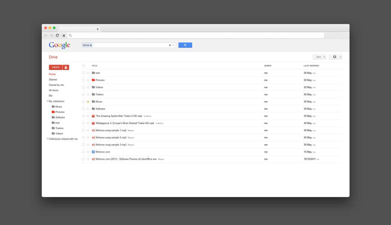
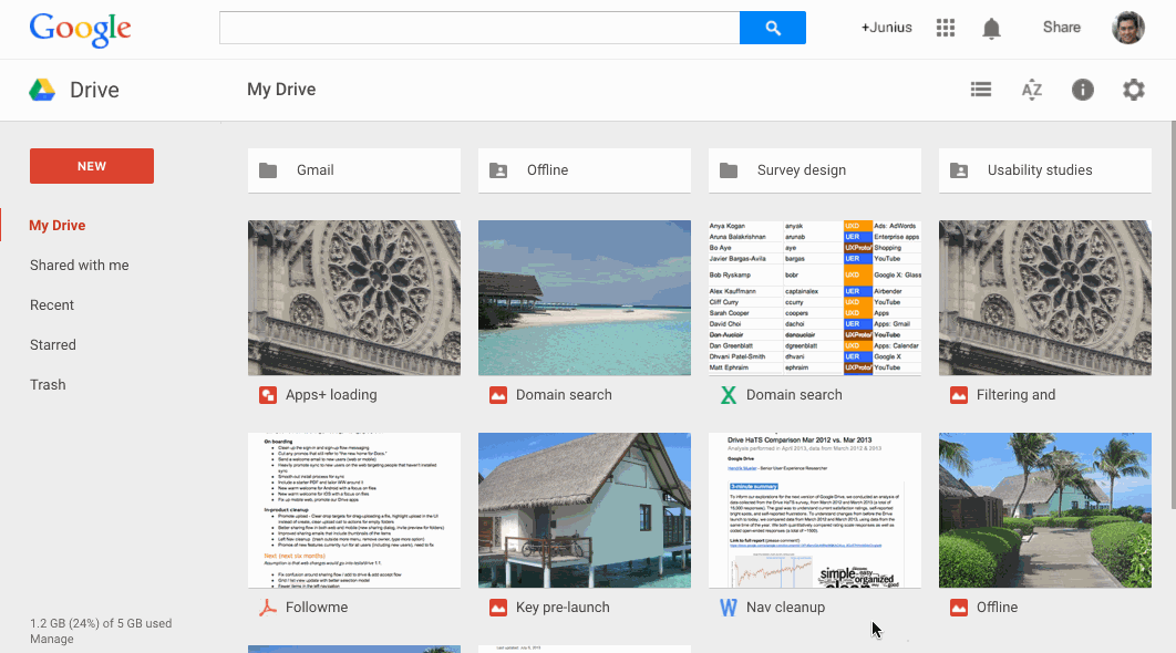
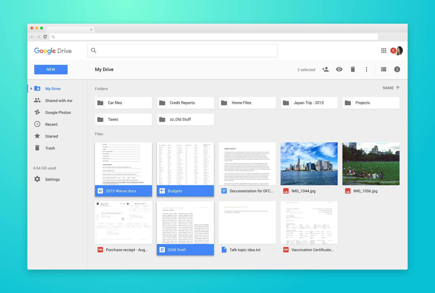
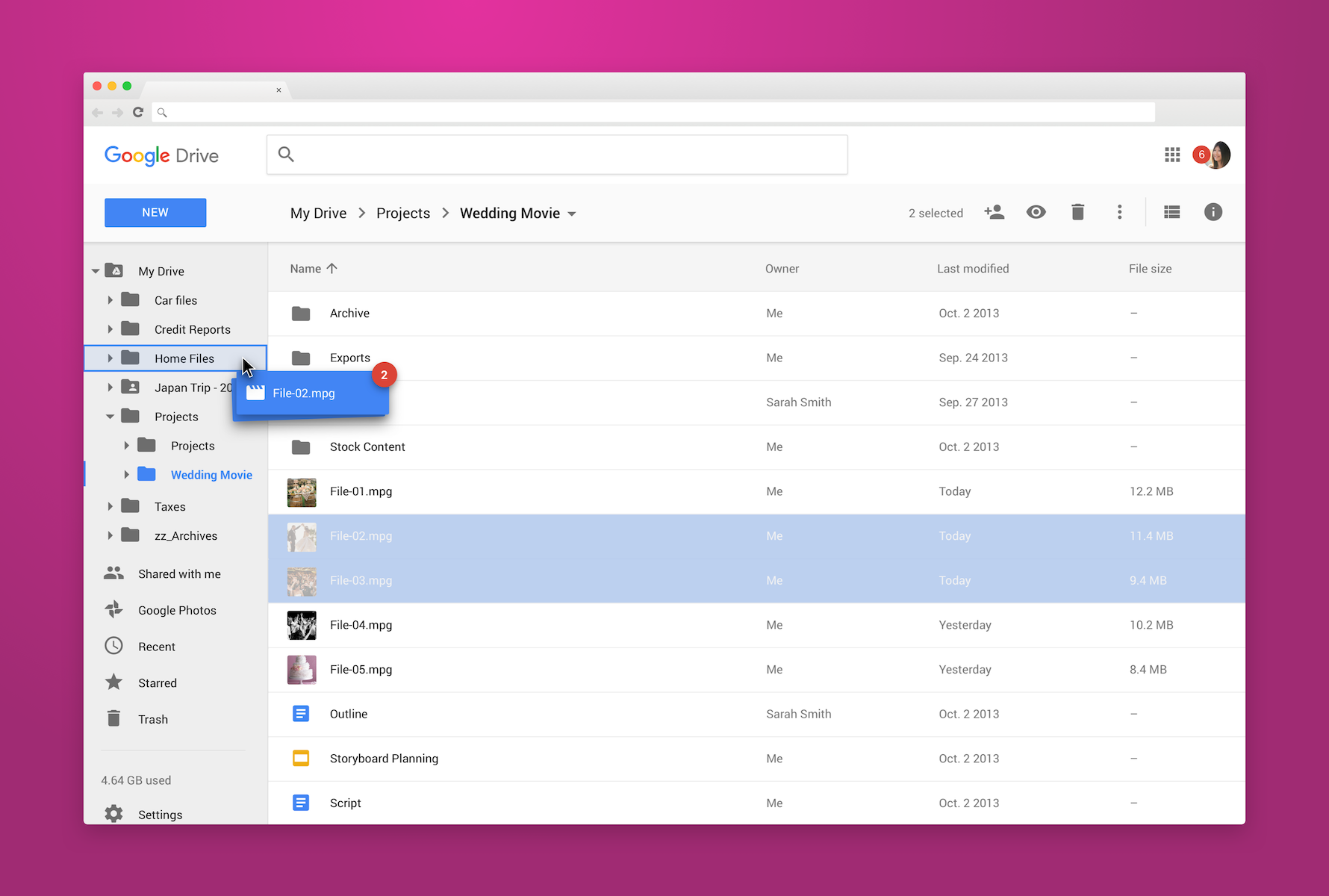
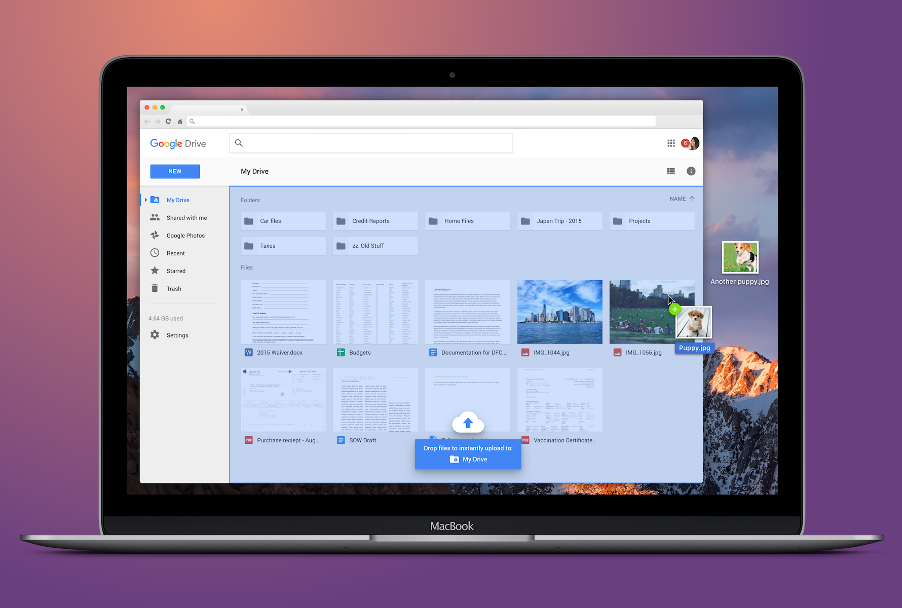
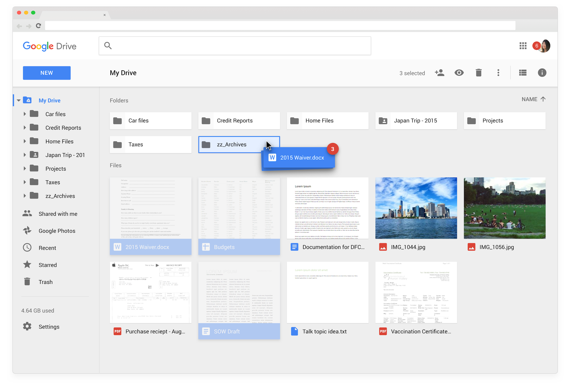
Since Google Drive's initial launch in 2012, the biggest user complaint was that it was too tedious to organize files in the web UI. In 2013, the Drive UX team began an initiative to change the selection model in order to better facilitate file organization.

My Role

  • Product Designer
  • Prototyper
  • UI Designer

Platforms & Screen Sizes

  • Web

Goals

  • Make file/folder organization faster and easier.
  • Surface easy access to contextual actions when users need them most often.
  • Modify the look and feel of Drive's UI to better facilitate the new interactions.
  • Improve accessibility within the app.

Before

Drive initially launched with a single-click to open model, which followed the standard interaction paradigms of the web. As a result, multi-selection of files required several clicks on small click targets (checkboxes). Users were unhappy with how long it took to make complex selections compared to a traditional desktop file system.

Drive web UI 2012—2014

Proposed Solution

Allow users to interact with Drive like a desktop filesystem.

Essentially, ignore the current web paradigms and introduce a single-click to select / double-click to open model. This proposal introduced several questions and challenges. Would users understand the model change? Would it actually help them organize more quickly and effectively? Could we technically design and build the proposed experience?

The idea also was initially met with skepticism from product leadership and intense criticism from Google employees (mostly engineers). It was crucial that we spend a lot of time testing and verifying the concept in order to have data to prove its effectiveness.

User Testing

Several rounds of testing was conducted with interactive prototypes. Users were given organizational tasks to complete with the prototypes. Success was measured empirically by observing how much time it took users to complete tasks, and anecdotally by asking users to compare the experience to the current Drive UI.

A later-stage prototype.

The overall experience proved to be a significant improvement over the current UI. Through testing we learned the importance of visual feedback in the organizational experience and subsequently spent a significant amount of time on optimizing animations.

Finals

In addition to the interaction improvements, the UI was given a visual refresh with special attention given to improved accessibility.

Google Drive Grid View Grid view - file selection.

Google Drive List View List view - organizing files in side navigation tree.

Google Drive drag to upload from desktop Drag to upload from desktop.